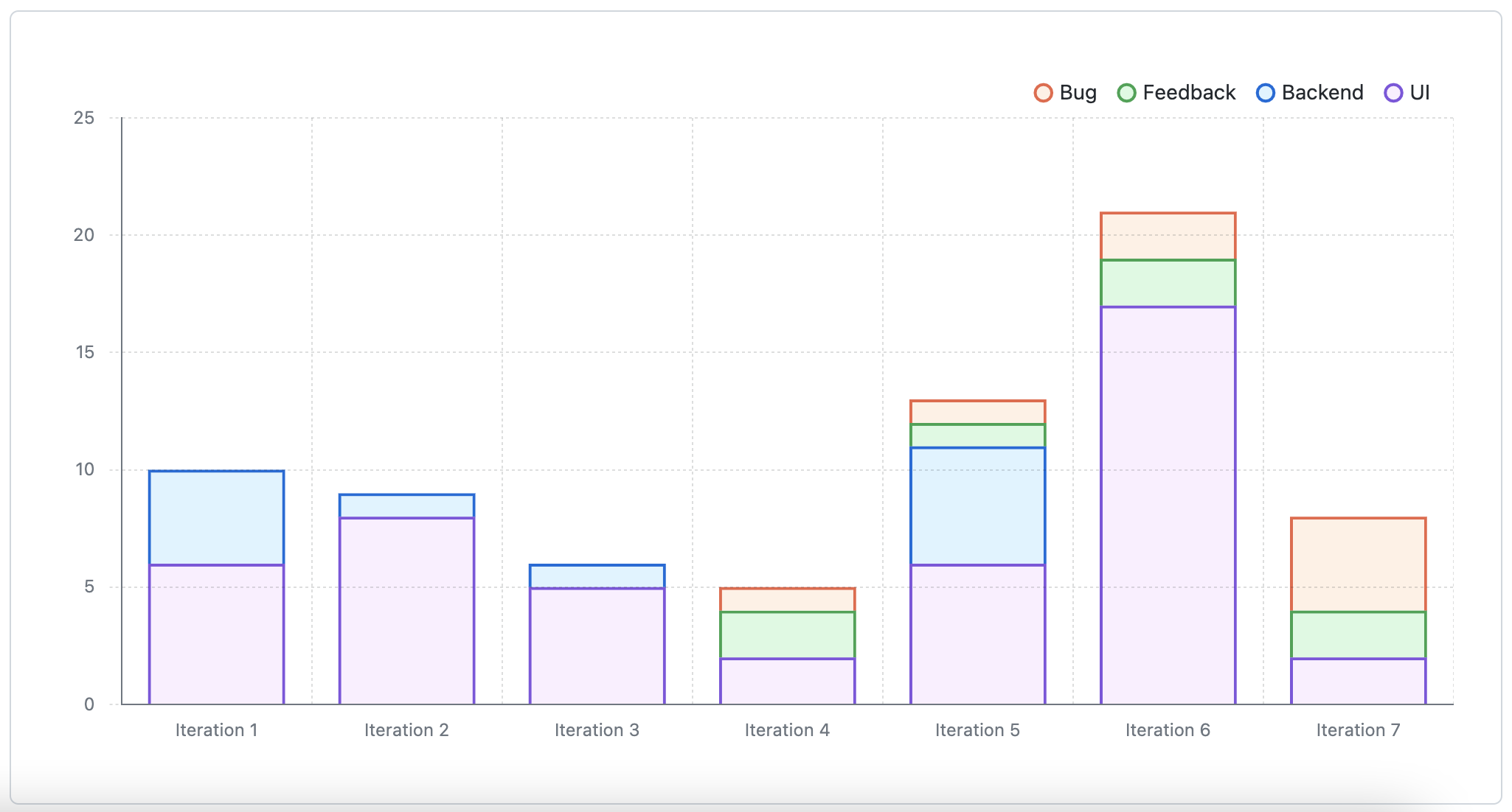
You can use insights for Projects to view, create, and customize charts that use the items added to your project as their source data. You can apply filters to the default chart and also create your own charts. When you create a chart, you set the filters, chart type, the information displayed, and the chart is available to anyone that can view the project. You can generate two types of chart: current charts and historical charts.
Insights does not track items you have archived or deleted.
About current charts
You can create current charts to visualize your project items. For example, you can create charts to show how many items are assigned to each individual, or how many issues are assigned to each upcoming iteration.
You can also use filters to manipulate the data used to build your chart. For example, you can create a chart showing how much upcoming work you have, but limit those results to particular labels or assignees. For more information, see "Filtering projects."

For more information, see "Creating charts" and "Configuring charts."
About historical charts
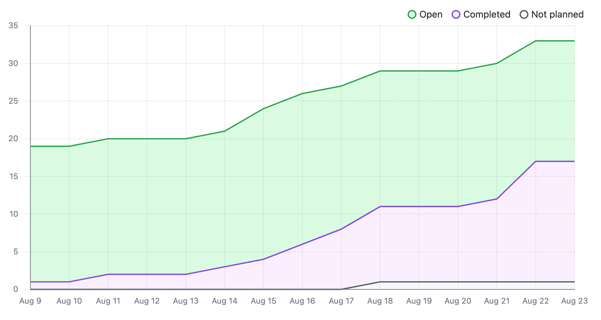
You can create historical charts to visualize your project items over time. Historical charts track changes to the state of your project items. You can see "Open" items with open issues and pull requests, "Completed" items with issues that were closed as completed or merged pull requests, "Closed pull requests", and "Not planned" items with issues that were closed as not planned. You can view the number of items or aggregation of items over time.
The default "Burn up" chart allows you to visualize the progress of your issues over time, showing how much work is completed and how much is left to do. You can use this chart to view progress, spot trends, and identify bottlenecks to help move the project forward.

To create a historical chart, set your chart's X-axis to "Time." You can also use filters to manipulate the data used to build your chart. For more information, see "Filtering projects."
For more information, see "Creating charts" and "Configuring charts."